After 66 years, Hai Ha prepares to transform its brand
Translated from Vietnamese, summarized and contextualized by DistantNews.
At a glance
News
Sources not specified
New plan
- Vietnamese confectionery company Hai Ha is rebranding with a new logo and modernized packaging to appeal to younger consumers.
- Established in 1960, Hai Ha aims to adapt to the competitive fast-moving consumer goods market by refreshing its image while retaining its traditional flavors.
- The rebranding, including a shift from a ship symbol to a modern wordmark and a flower icon, is part of a strategy to "Transform - Breakthrough" and enhance competitiveness.
Hai Ha Confectionery, a Vietnamese brand with a 66-year legacy, is undergoing a significant transformation, starting with a new logo and modernized packaging. This strategic move aims to rejuvenate its products and broaden its consumer base, particularly targeting the younger generation.
Founded in 1960, Hai Ha has long been a leading name in Vietnam's confectionery industry. Its journey began in a nascent market where sweets were treasured gifts, etching memories for generations. For over six decades, the brand has been a familiar presence, offering products like jelly candies, fruit candies, milk candies, and cakes, often characterized by traditional, colorful packaging.
However, in Vietnam's increasingly competitive fast-moving consumer goods (FMCG) market, younger consumers are emerging as the primary demographic, demanding higher standards of experience and personalization. To maintain its market position, Hai Ha recognizes the need to evolve beyond its traditional quality and image. The company is actively adapting to this new landscape, with a key focus on redefining its brand identity through a new logo.
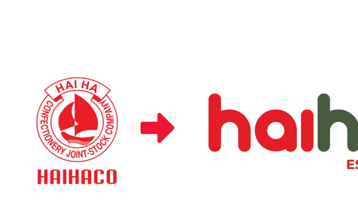
The new logo replaces the previous ship symbol, which represented the company's manufacturing origins, with a modern wordmark. This change signifies a shift towards becoming a more consumer-friendly brand. The updated typography is softer, conveying a sense of friendliness and modernity, while a new flower icon evokes nature, care, and joy, values closely associated with confectionery. The brand's signature red and blue color scheme is retained but refined, balancing heritage with innovation. The "Est 1960" detail remains, underscoring the brand's long-standing heritage.
According to Hai Ha representatives, the new logo is not a complete overhaul but a way to adopt a suitable visual language to continue its 66-year-old story. While the external appearance is modernized to align with current trends, the "soul", the traditional flavors of its confectionery, will be preserved. Alongside the logo change, packaging systems are also being refreshed to enhance product recognition and perceived value in the retail environment. This evolution seeks to balance modern aesthetics with a sense of familiarity, appealing to a wider range of customers. Hai Ha plans to announce its core strategy, "Transform - Breakthrough," at its 2026 Customer Conference.
DistantNews Editorial
Originally published by Tuổi Trẻ in Vietnamese. Translated, summarized, and contextualized by our editorial team with added local perspective. Read our editorial standards.
More Stories
From Our Blog

What Gets Lost (and Found) When News Is Translated

The Critical Role of Diaspora Media in Global News

What Travellers Should Know About Countries with Restricted Press

A Digital Nomad's Guide to Following Local News

How the Same Story Looks Different in Different Countries
