
Strawberry mochi brand 'Yeonbaek 1227' unveils rebranding for global, premium push
Translated from Korean, summarized and contextualized by DistantNews.
At a glance
News
Sources not specified
Outcome reported
- The strawberry mochi brand 'Yeonbaek 1227' has undergone a rebranding by design studio Duedance to enhance its global and premium market appeal.
- The new name 'Yeonbaek 1227' signifies 1,227 instances of kneading and effort in creating a single product, symbolizing the brand's dedication.
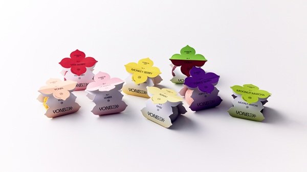
- The rebranding includes a simplified English name 'YONBEK' and a new visual identity inspired by strawberry blossoms, applied across packaging and retail spaces.
The Korean traditional dessert brand, formerly known for its strawberry mochi, has officially rebranded as 'Yeonbaek 1227.' The rebranding project, led by brand experience design studio Duedance, aims to elevate the brand's image for global expansion and reinforce its premium positioning. The transition, which took place over six months, sought to create a cohesive brand system applicable across various domestic and international distribution channels.
The original brand, 'Yeonbaek Strawberry Mochi,' built its reputation on a 3rd-generation family recipe using fresh strawberries and a unique non-hardening dough. It gained significant popularity, particularly around Seoul's Yeonnam-dong district. The bold name change to 'Yeonbaek 1227' introduces a new layer of meaning: the number '1227' represents the 1,227 kneading processes involved in perfecting a single product, highlighting the brand's commitment and the time invested in its creation.
To improve global recognition and pronunciation, the brand's English name has been simplified to 'YONBEK.' This strategic move maintains the brand's core identity while adapting to the international market. The new visual identity, centered around the motif of a strawberry blossom, is integrated into various elements, including packaging and pop-up store designs. This consistent application across all customer touchpoints aims to deliver a unified premium experience.
The packaging design has also been refined, with distinct lines for general sales and premium gift boxes to maximize the product's value as a high-end gift. A spokesperson for Yeonbaek 1227 stated, "This rebranding is highly significant in visually conveying the product's high quality while establishing a brand system that can consistently compete in overseas markets." Duedance, the studio behind the project, specializes in comprehensive design solutions, from naming to integrated online and offline brand experiences.
This rebranding is highly significant in visually conveying the product's high quality while establishing a brand system that can consistently compete in overseas markets.
DistantNews Editorial
Originally published by Dong-A Ilbo in Korean. Translated, summarized, and contextualized by our editorial team with added local perspective. Read our editorial standards.
More Stories


From Our Blog

What Gets Lost (and Found) When News Is Translated

The Critical Role of Diaspora Media in Global News

What Travellers Should Know About Countries with Restricted Press

A Digital Nomad's Guide to Following Local News

How the Same Story Looks Different in Different Countries
