
Spotify reverts to old logo after user backlash
Translated from Turkish, summarized and contextualized by DistantNews.
At a glance
News
Named sources
Outcome reported
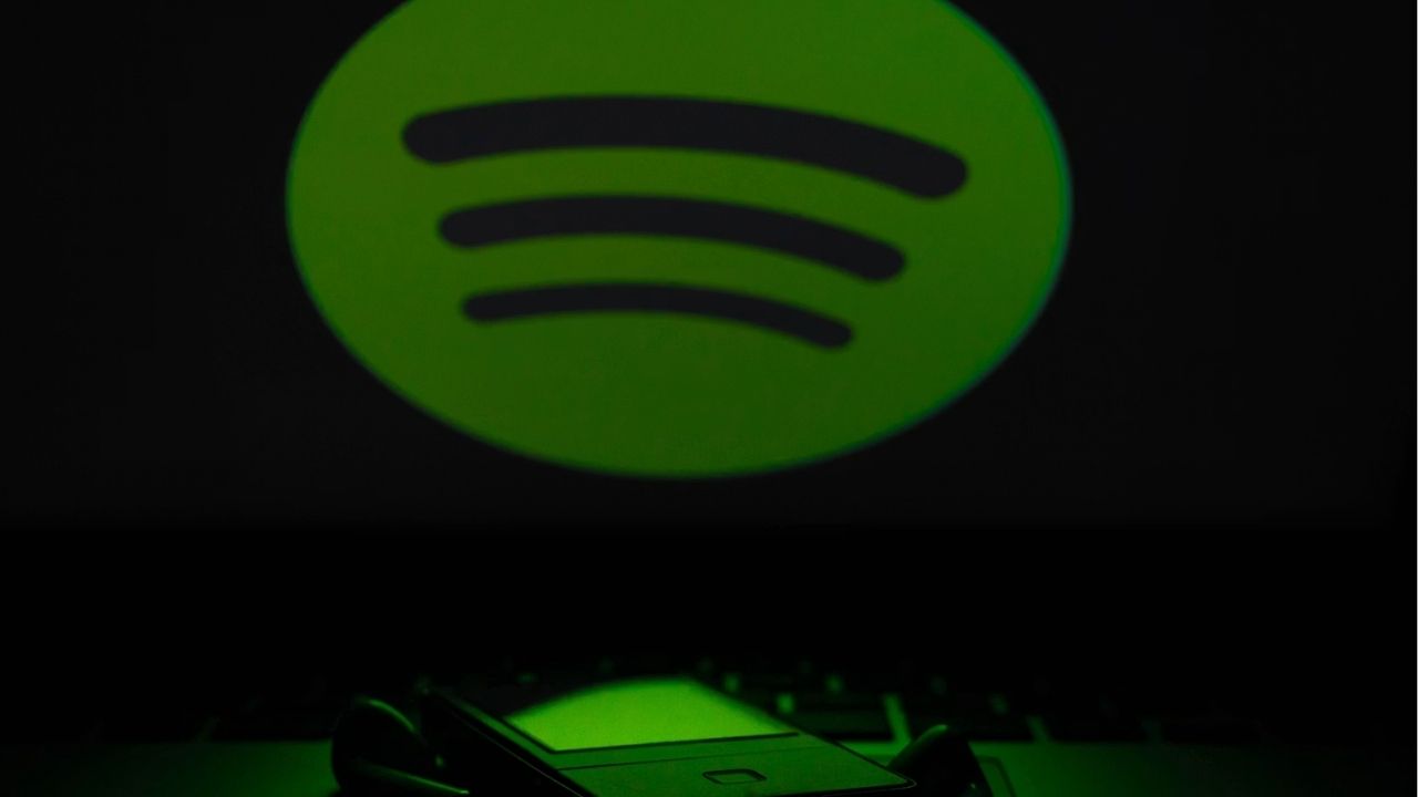
- Spotify reverted to its old green logo after facing criticism for its updated mobile app design.
- Some users compared the new logo to a 3D disco ball and found it visually unappealing.
- The company had previously acknowledged the logo's reception and promised a return to the original design.
Spotify has reinstated its classic green logo for its mobile application following a wave of user criticism regarding a recently updated design. The streaming service had introduced a new logo just a few weeks prior, which quickly drew negative reactions from its user base.
Many users likened the new logo to a three-dimensional disco ball, expressing dissatisfaction with its aesthetic. Complaints centered on the logo appearing outdated or poorly rendered, prompting widespread calls for Spotify to revert to its familiar green branding. The perceived visual downgrade led to significant user discontent.
Spotify acknowledged the backlash, with company officials issuing a statement on May 17. They recognized that the updated logo was not universally well-received. In response to the user feedback, Spotify had announced that the logo would be changed back to its original form within a few weeks.
The latest app update confirms this promise, bringing back the widely recognized green logo. This move aims to appease users who preferred the previous design and address the negative sentiment generated by the short-lived redesign.
they understood that the logo was not suitable for everyone and that the logo would return to its old form within a few weeks.
DistantNews Editorial
Originally published by Cumhuriyet in Turkish. Translated, summarized, and contextualized by our editorial team with added local perspective. Read our editorial standards.
More Stories


From Our Blog

What Gets Lost (and Found) When News Is Translated

The Critical Role of Diaspora Media in Global News

What Travellers Should Know About Countries with Restricted Press

A Digital Nomad's Guide to Following Local News

How the Same Story Looks Different in Different Countries
